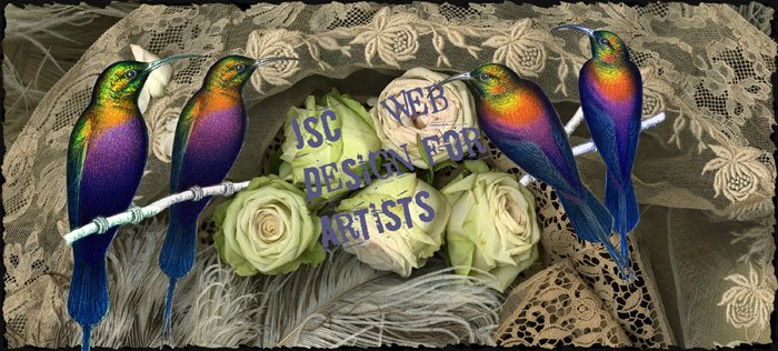
So, this is my Photoshop Mock-up. I'm still experimenting with colors and layout, and I really like this one (the layout) because it's pretty simple, and doesn't have a whole lot of potential for confusing people or muddling things up. I know that I will probably be making more sections, such as subdivisions for the artwork itself (like digital, photography, so on..) and was thinking maybe a drop-down menu would be a highly organized way to do that. I still have a lot of experimenting to do before I feel I will be satisfied with the look and operation of my site.

Nice work Katie, I instinctivly pressed the arrows trying to navigate through your page before realizing that i couldn't. I like the image you've chose and the layout is simple, allowing the user to enjoy the imagery without being too overwhelmed. Nice work!
ReplyDelete